21

I’m Piper, Director of Product Design for our Community Products org and the designer working on the Ethereum Stack Exchange theme. I’ve spent some time reviewing your thoughts from our first post and doing my own research and I’m excited to share what I’ve come up with. Thank you for your patience.

I was very inspired by the geometric theme and pastel colors that Ethereum is now using and the artwork that you all shared with me. With the mention that the site wanted something fun, I continued to explore that bold style.

Color scheme

Proposed color palette for the Ethereum Stack Exchange site, incorporating 6 colors: purple, teal, blue, light brown/peach, pink, and light teal.

The colors I chose came directly from Ethereum’s site via some precision eye drop skills. The gorgeous pastels worked well with one another and not much tweaking was needed.

Logo

Proposed logo for the Ethereum Stack Exchange site, as described below. The icon shows the Ethereum logo embedded within a hexagon chat bubble. The text "ethereum" appears to the right of the icon, with both the icon and text appearing in a darker blue color.

Proposed logo for the Ethereum Meta Stack Exchange site. It is largely identical to the proposed logo for the main site above, with 2 main differences: the text says "ethereum meta" instead, and the icon and the word "ethereum" appear in black instead (while "meta" appears in a dark gray).

I really loved the logo design from an earlier post that explored Ethereum's logo embedded within a hexagon chat bubble. I made the diamond a solid color to help it survive more sizes (hello favicon) and moved the logomark to the right to make better use of the space.

Badges

Proposed badges for the Ethereum Stack Exchange site, as described below. There are 3 badge colors: bronze, silver, and gold.

I updated badges to be a dimensional diamond. Hopefully you find it simple, but interesting.

Page Design

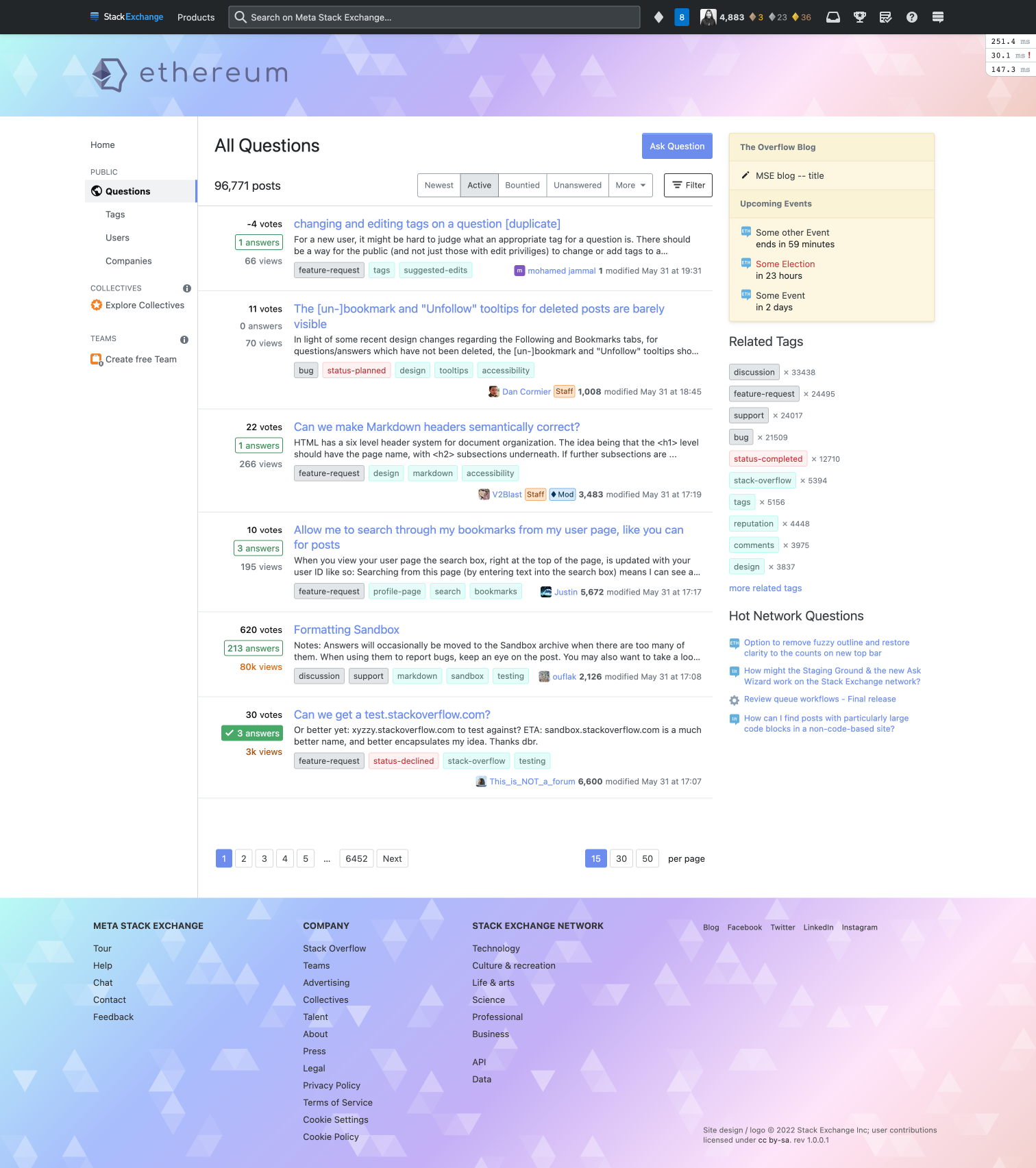
Proposed page design/style, as described below, showing the site's Questions page (/questions). The header and footer of the page are in a horizontal gradient of pastel colors, ranging from teal to blue to purple to pink, with a faded triangle pattern intermittently overlaid on it. Question titles and other links appear in periwinkle, while regular tags appear with a teal background.

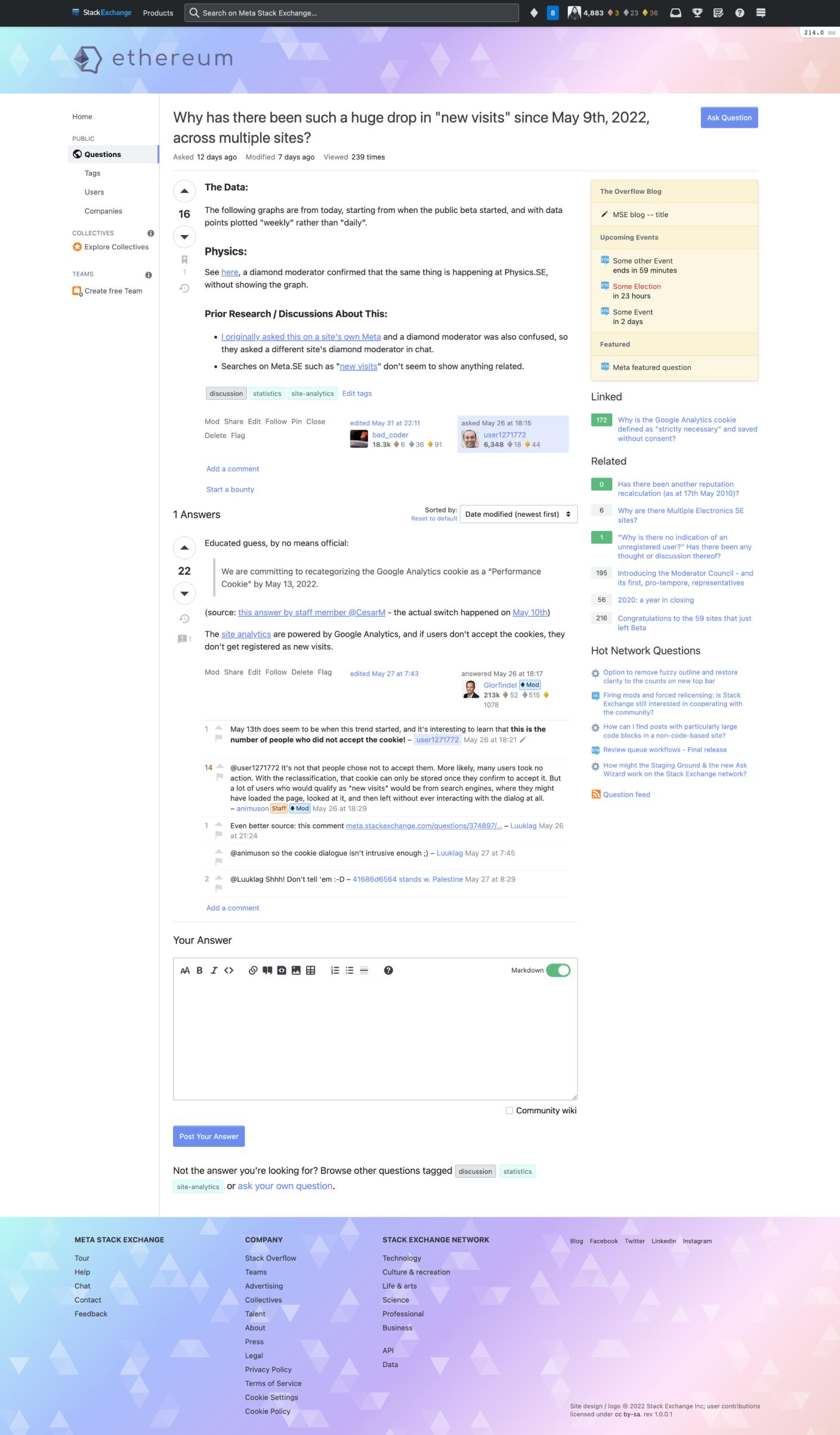
Proposed page design/style, as described below, showing a question page.

I used the color palette to create a gradient. To add interest, I used an overlay of triangles of various opacities. I wanted to keep enough white to balance the strong style and keep it feeling fresh and modern, similar to the Ethereum org website. I still question whether the footer should have a gradient background or be white—I look forward to your thoughts :)

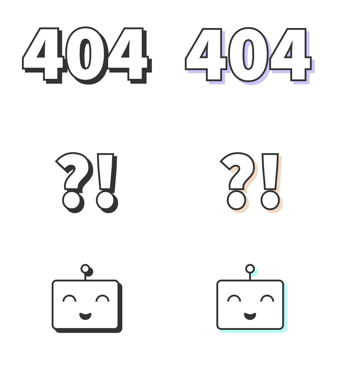
Various proposed error page illustrations for the Ethereum Stack Exchange site, in both greyscale and color. There are 3 different icon designs, all with drop shadows: the text "404" (with a purple shadow), the text "?!" (with a light brown/peach shadow), and a smiling robot (with a teal shadow). The greyscale versions of these icons simply have black shadows instead.

Error pages will incorporate these simple images inspired by various Ethereum conferences and the hover state on the Ethereum org website.

We hope you enjoy this design, but if something doesn’t feel right, now is your chance to share your feedback. This window for feedback will be open for one week. We will then work to incorporate feedback as best as we can, finalize things on our end, and lastly, deliver the design to your site.

5
  • 2
    It looks pretty good! Just out of curiosity, will there be a dark mode?
    – Ismael Mod
    Commented Jun 10, 2022 at 0:43
  • 1
    @Ismael We don't have immediate plans to add dark mode outside of Stack Overflow. Our goal right now is to get designs going and then go from there.
    – Catija Staff
    Commented Jun 10, 2022 at 19:51
  • @Catija Thanks for the answer! I'll forward the message when someone asks about it.
    – Ismael Mod
    Commented Jun 10, 2022 at 22:51
  • 2
    The final design is now live! See this post for more details: New site design launched
    – V2Blast Staff
    Commented Jul 18, 2022 at 18:56
  • Why was Meta SE used for these examples? Commented Aug 13, 2022 at 12:15

7 Answers 7

8

Badges

Proposed badges for the Ethereum Stack Exchange site, as described below. There are three badge colors: bronze, silver, and gold.

I updated badges to be a dimensional diamond. Hopefully, you find it simple but interesting.

I love them! Custom badges were always my favorite about StackExchange site themes!

I'm wondering if we can make them look like the ethereum glyphs:

ethereum glyphs

(Excuse my poor graphics skills and open-source software. xD)

1
  • 2
    I can definitely do that!
    – Piper Staff
    Commented Jun 16, 2022 at 12:46
3

The footer I think should just be a lighter version so the black text is more easily readable, but besides that it's beautiful.

1
  • I agree! This or making the background darker and bright font.
    – q9f
    Commented Jun 13, 2022 at 10:41
3

I'm excited to see this come through, it looks great!

The only thing I got stuck on was the logo.

Looking at it without any history, my eyes couldn't parse what was happening. It looked like an unfolded paperclip holding onto the Ethereum logo. I had to click your link to understand the hexagonal speech bubble concept. It's a cool concept, and I'm not a designer so I don't really have a specific suggestion. Sorry! (Maybe play with continuing the hexagon around the logo to place it fully inside?)

Anyway, just some feedback from someone who appreciates the community but doesn't know anything about design, so take it as such. :)

3
  • 1
    I also think it is a bit "too pointy", but it was the logo with more votes: Can we get a logo and a header?.
    – Ismael Mod
    Commented Jun 12, 2022 at 4:49
  • I agree the logo needs some work.
    – q9f
    Commented Jun 13, 2022 at 10:42
  • I think part of it is that speech bubbles normally start from bottom-left rather than bottom-right. It would be interesting to see what happens if that adjustment is made so that the diamond is on the right?
    – eth Mod
    Commented Jun 16, 2022 at 4:52
2

Looks great Piper, thank you!

If possible to incorporate, I like the Ethereum glyphs suggested by @q9f:

ethereum glyphs

The other feedback I'm paying more attention is about lightening up the footer, as it may be too much for power users seeing it all the time. If lightening it up doesn't work so well, I wouldn't mind keeping the footer as is: it's also a similar shade to one in the color scheme you've chosen.

I agree that the logo is not understandable near face value... To me it even started looking like the outline of someone's head. I think part of it is that speech bubbles normally start from bottom-left rather than bottom-right. It would be interesting to see what happens if that adjustment is made so that the diamond is on the right.

To make it clearer as a speech bubble, how about trying to have the diamond be on the right side of the bubble?

1
  • 2
    I replaced the logo with another one that @q9f suggested and shared with the CMs and other designers and all agreed it flowed much better. You had me laughing with the head comment though! I am working on the footer now and then we will nearly be there :)
    – Piper Staff
    Commented Jun 16, 2022 at 12:48
1

Color scheme

Proposed color palette for the Ethereum Stack Exchange site, incorporating six colors: purple, teal, blue, light brown/peach, pink, and light teal.

The colors I chose came directly from Ethereum's site via some precision eye drop skills. The gorgeous pastels worked well with one another, and not much tweaking was needed.

I think these colors work very well. I'd be personally open to diverging from what we can find on ethereum.org; however, this color scheme is well recognizable and works with the proposed site design.

1

Logo

Proposed logo for the Ethereum Stack Exchange site, as described below. The icon shows the Ethereum logo embedded within a hexagon chat bubble. The text "ethereum" appears to the right of the icon, with both the icon and text appearing in a darker blue color.

Proposed logo for the Ethereum Meta Stack Exchange site. It is largely identical to the proposed logo for the main site above, with two main differences: the text says "ethereum meta" instead, and the icon and the word "ethereum" appear in black instead (while "meta" appears in a dark gray).

I really loved the logo design from an earlier post that explored Ethereum's logo embedded within a hexagon chat bubble. I made the diamond a solid color to help it survive more sizes (hello favicon) and moved the logomark to the right to make better use of the space.

I'm happy you picked up the winning logo from the older thread!

However, I don't think this works for the proposed design. Here are some unordered thoughts:

  • The shape is not easily recognizable; it's a bit confusing for the eye as to what is the user looking at
  • The color comes from an old logo version, dating back 7-8 years. So I would avoid using this specific color scheme (grey-blue-ish). The black one could work, though.
  • It somehow does not fit the style of the proposed site theme; it feels somewhat forced into the design.

I would encourage you to look at proposals B (my favorite) and D in the linked thread regarding the potential of working with the logo and diverging from the initial diamond shape. This does not necessarily mean I want to go with the other logos; instead, suggesting we can be more open-minded here.

2
  • IMHO the grey-blue-ish is also nice :) The color-filled ones at ethereum.org/en/assets don't work in as many contexts.
    – eth Mod
    Commented Jun 16, 2022 at 4:47
  • I haven't been following the conversation too closely, but it seems the final logo changed to be proposal B. I just have to say I can't get over the fact that every time I see it, it looks like something all the cool guys draw everywhere when they're 15 years old - something representing a vagina. Commented Jul 15, 2022 at 6:07
1

Page Design

Proposed page design/style, as described below, showing the site's Questions page (/questions). The header and footer of the page are in a horizontal gradient of pastel colors, ranging from teal to blue to purple to pink, with a faded triangle pattern intermittently overlaid on it. Question titles and other links appear in periwinkle, while regular tags appear with a teal background.

Proposed page design/style, as described below, showing a question page.

I used the color palette to create a gradient. To add interest, I used an overlay of triangles of various opacities. I wanted to keep enough white to balance the strong style and keep it feeling fresh and modern, similar to the Ethereum org website. I still question whether the footer should have a gradient background or be white—I look forward to your thoughts :)

I think the gradient and colors work well in the header and triangle shapes. However, as mentioned in the other answer, the logo does somehow not fit the theme.

I was wondering if we could use the same design for the footer but make it dark? Or maybe less saturation. Currently, the site is very colorful, and it could be too much for power users returning every day. :P

What do you think?

PS: The error images are so cute!

You must log in to answer this question.

Not the answer you're looking for? Browse other questions tagged .